

In this post, I will discuss 7 logo design tips for startups.
In a world where a new startup surfaces every other day, it takes a lot to thrive in the market. You need to cut through the noise and make a mark on the prospects, and an impressive logo is one way to do that.
Know that the secret to a great logo isn’t adding more to its design. Instead, you need a strategic image blended with text (or either of the two) to leave a lasting impact on everyone who sees it. And no, you don’t need a huge budget to create such logos. All you need is a team of creative heads or even one genius to play it out. The tips below outline the essential rules of logo design to help your startup look like a market leader from day one.
Table of Contents
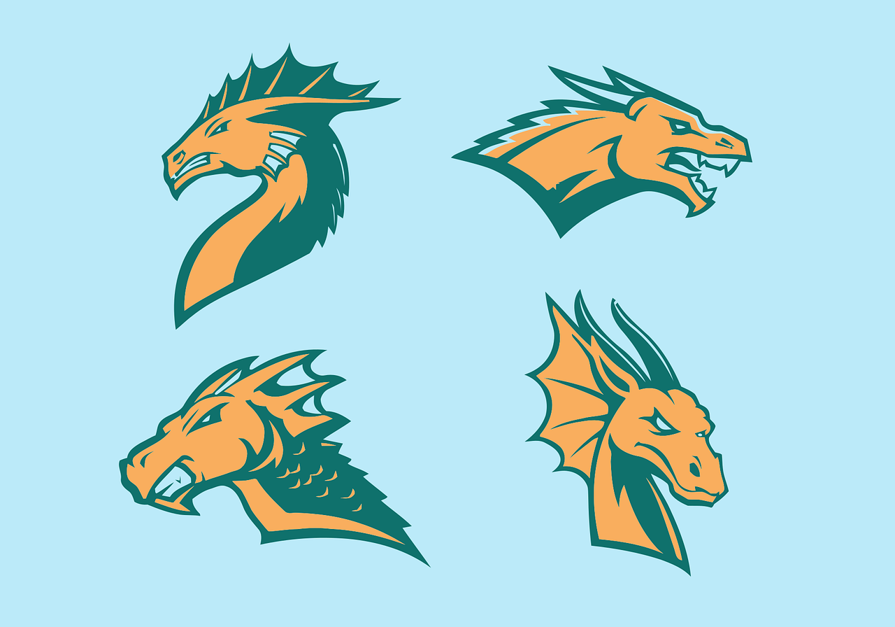
1. Use a Conceptual Design

A logo doesn’t need to show what you are selling or spell out the entire brand’s name. It should subtly represent what your company does. So, for instance, a bakery can use a rolling pin. But you can also use an abstract icon to express a brand’s mission or purpose.
Take Nike’s Swoosh. It isn’t a shoe, but it suggests movement and speed instantly. That’s the power of a conceptual logo. It’s more flexible, more emotional, and easier to remember. The key here is to keep it simple. The best designs are those that stay in memories forever, and cluttering it is not the way to go.
A key tip here is to partner with a well-reputed logo design company. Professionals can help you create a design that people will remember at a single glance.
2. Embed Popular Fonts
Text matters just as much as visuals in a logo. Some brands combine icons and words, while others use typography-only logos made entirely from letters. If you’re unsure where to begin, current design trends can offer helpful direction.
In 2024, designers ranked simple shapes as the top trend, followed by symbolism and bold or experimental typography. For text-based logos, classic fonts are still popular. They need to be used with a modern edge. Helvetica leads for its clarity and flexibility (41%), Futura for its clean, geometric style (39%), and Montserrat for its modern feel (34%).
3. Use Clean Spaces
For many businesses, an icon alone isn’t enough. That is why they include a tagline with the logos to make it self-explanatory. Most logo makers and logo design companies make this easy by letting you add your name and a short line of text. A tagline, or slogan, is a brief phrase that captures your brand’s personality and message.
Not every business needs a tagline, and that’s perfectly fine. Still, the space in your logo can be used smartly. If your brand name is long, consider splitting it into two lines using the same font and size. It keeps the design balanced while making the logo easier to read.
4. Blend Classic and Modern
Modern means feeling current, but not so tied to the moment that your logo looks outdated in a few years.
This is the point where modern and trendy differ. Trends are popular now and fade fast. Contemporary design is more subtle and balanced. It reflects the times without relying on flashy details that quickly go out of style.
A good logo feels contemporary without chasing what’s “hot.” If it leans too heavily on trends, it can start to look outdated. And when that happens, your brand can feel outdated too.
Go for a modern overall look, from your colors and fonts to the finer design details. Many strong brands do this well. Logos like Starbucks and Burger King have evolved slowly over time, making minor updates while keeping their core identity intact.
5. Adjust Name and Tagline
Visual balance is highly integral in a logo. Even though your tagline is usually smaller, it should line up neatly with your brand name to create a neat look. So, for example, if one element is much longer, you can tweak the others, like the font style or size, to fix the imbalance.
As a general guideline, your tagline should always be shorter than your brand name, ideally no more than 25 or 30 characters. This keeps the logo easy to read and visually clear. Create contrast by using a bold or heavy font for your name and a simpler font for the tagline. This allows both elements to work together without competing for attention.
6. Choose Scalable Designs

A good logo should work at any size. It doesn’t matter if it’s big or small. It should stay clear and easy to recognize wherever it’s used. This applies to both the text and any symbols in your design.
Logos with too much detail often lose clarity when scaled down. Even though there’s no single size that fits every use, creating your logo as a high-resolution vector makes it easy to resize and adapt for different platforms and file types. That way, your logo looks good everywhere. You can place them across websites and business cards, wherever you want!
7. Design like a Vector File
Your logo needs to work everywhere. Sometimes you need to place it on tiny items like pens, and sometimes on large displays like billboards or banners. A small JPG file, such as 500 × 500 pixels, won’t hold up because resizing it too much will make it look blurry and pixelated.
That’s where vector files come in. Unlike JPGs, which are made of pixels, vector images use lines and curves to build the design. This allows you to resize your logo to any size without losing quality or shape.
If you create your logo as a vector from the start, you’ll save yourself a lot of trouble later and ensure it always looks clean and professional.
The Bottom Line
At the end of the day, your logo is like the front door of your startup. It doesn’t need to be complicated or spell out everything you do. It just needs to be thoughtful.
Avoid trying to say too much in one logo. Rather, you should focus on keeping it clean and aligned with your brand’s purpose. Note that trends will fade, but a well-designed logo will grow with your business. With time, it eventually becomes a symbol of the trust and quality you offer.
Keep it simple, stay consistent, and let your brand speak for itself!
INTERESTING POSTS
- Top 4 Benefits Logo Templates Can Bring To Your Business
- AIVector: A Practical Guide to AI Vector Creation
- Why Facebook Were Right To Hit F5 And Refresh?
- 9 Proven Cybersecurity Tips For Startups
- Top 4 Online Video Editors For Adding Subtitles To Videos
- Why Should Startups Use A VPN? [#4 ANSWERS]
- Why Digital Marketing Is Crucial for Startup Success
About the Author:
Mikkelsen Holm is an M.Sc. Cybersecurity graduate with over six years of experience in writing cybersecurity news, reviews, and tutorials. He is passionate about helping individuals and organizations protect their digital assets, and is a regular contributor to various cybersecurity publications. He is an advocate for the adoption of best practices in the field of cybersecurity and has a deep understanding of the industry.
